

Collabosaurus
The mobile app solution for the matchmaker for business platform.
My Role
Research / Synthesis / Ideation
Sketching / Hi-fi Prototype
Methods
User Research / Affinity mapping
Survey / Usability test / Personas
Journey Map / Feature prioritisation
Visual design
Team and Duration
2 UX consultants
2.5 week sprint
Deliverables
Case study presentation
and Hi-fi App prototype
Client
Collabosaurus
Aug/Sep 2020
Tools
Figma / Miro

The platform
Collabosaurus is the matchmaker for brands.
It uses algorithms to connects complementary businesses for powerful cross promotions and collaborations in events, social media & product partnerships.
Collabosaurus makes finding and negotiating creative marketing collaborations simple, streamlining the partnership process to reduce the average time investment by over 75%.
The brief
1
Audit current
website listing process
Suggest updates based on research to reduce friction, potentially gamification and simplification of onboarding process.
2
Develop MVP & UI
for
a limited functionality mobile app
The initial app build is intended to increase engagement with existing clients. Whereby new traffic must create an account on the mobile website first (rather than the app).
- Match viewer (swipe right & left)
- Request viewer (swipe right & left)
- Chat with connections
Initial
problem
1
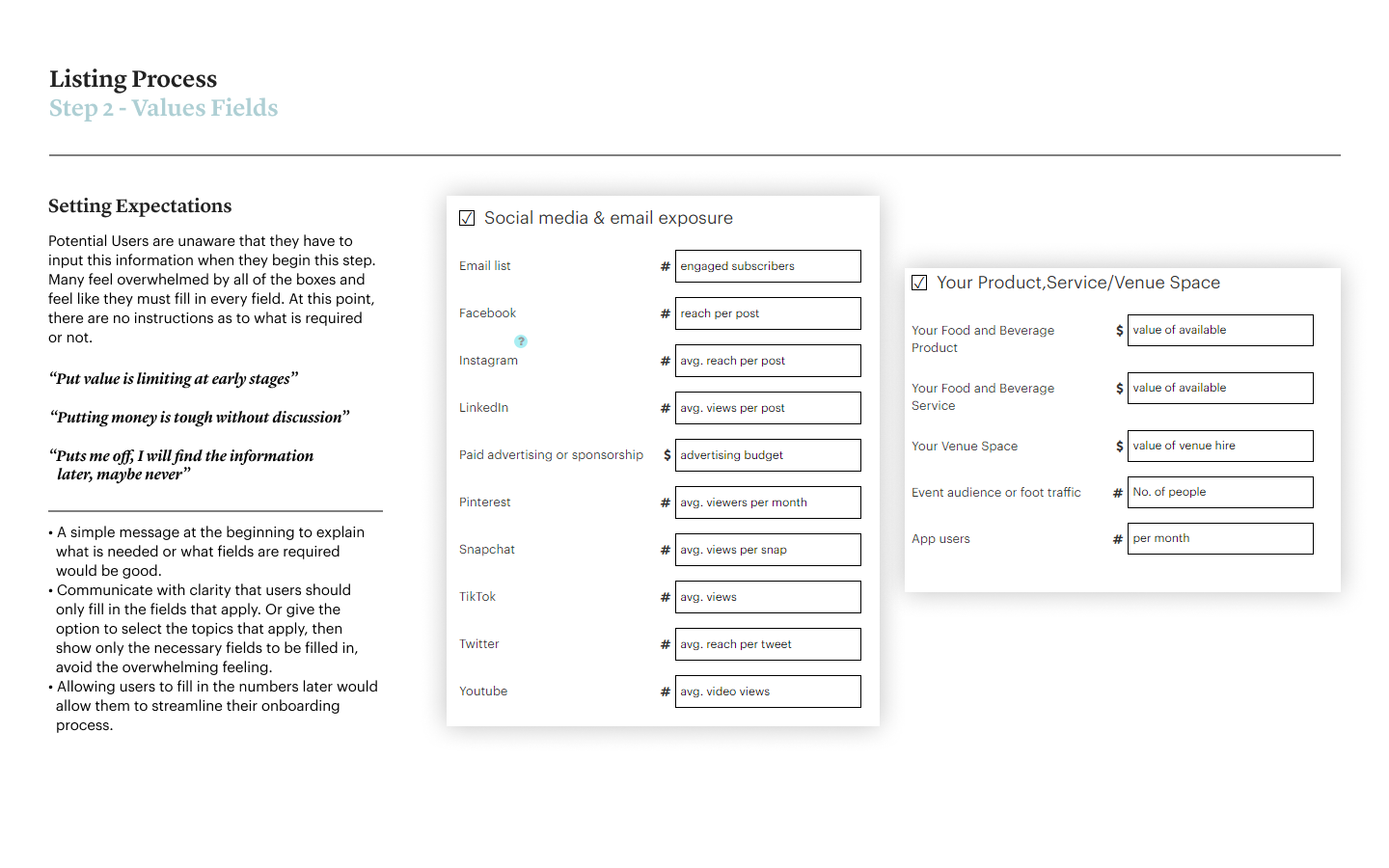
Overwhelming
listing process
Analytics showed high bounce rates during some parts of the listing process.
2
No efficient communication
between collaborators
There is a lack of means for collaborators to communicate effectively. E-mail notifications would be sent, prompting a user to log-in to the website to check their messages. 60-70% of these e-mails would end up in a spam folder or not visible immediately.
Research strategy
Our research evolved around the four areas of engagement. Within these areas, we wanted to get answers about how companies collaborate, what are their motivations and how they communicate.
We interviewed 4 current users and 3 potential users. We also conducted 3 usability tests on the current website with these 3 potential users.
Engagement
with
potential users
-
How do they do collaborations.
-
What would help them in that process?
-
Their expectations when collaborating • Is the home page communicating effectively?
Matching brand values and size of business
Current and potential users find that is important to match with a brand that is aligned with their brand values/ethics and according to the business size.
Engagement
when listing
-
Why are users not completing the listing process?
-
What are the main pain points in the process?
Engagement
when using
the platform
Engagement
between collaborators
-
Positive and negative things in the platform
-
Key Factors to connect
-
Different ways to collaborate
-
How’s communication done and it’s challenges
-
Validate the benefits of developing an app based platform
Home page audit
It was not part of the scope to audit the Home Page, but since we're going to conduct three usability tests with potential users, we thought that it would a great opportunity to discover pain points users might face when visiting the website. The client was very happy with the extra work and surprised by some findings.
Below you look at the key insights and flick through six pages of the document we put together pointing out some issues and considerations followed by some recommendations.


Listing process audit
We also got the three potential users to go through the listing process to identify the main pain point areas.
Below you look at the key insights and flick through nine pages of the document we put together pointing out some issues and considerations followed by some recommendations.


Research key findings
After synthesising all the insights from interviews and usability tests, we built an affinity map that shows some consistent patterns and thoughts from current users and potential users when collaborating.
1
Communication
Issues interacting with other collaborators
-
Users like that they receive email notifications, but there’s no direct way to reply.
-
Some users prefer to use email, but they know that younger collaborators might not use it.
Matching brand values and size of business
Current and potential users find that is important to match with a brand that is aligned with their brand values/ethics and according to the business size.
2
Factors to Connect
Matching brand values
and size of business
Current and potential users find that is important to match with a brand that is aligned with their brand values/ethics and according to the business size.
Find out more about potential collaborators
Users want a direct link to the matched brand’s website and social media so they can find out more about the brands.
3
Listing
Lack of Instructions
to input information
Users feel confused about the process and the steps they need to take to achieve collaboration before they begin.
Overwhelming amount
of fields to fill in
Options given in the onboarding process feel like too much to users, and they would prefer something more personalised to them.
4
Representation
Potential users need to feel like Collabosaurus is for them
Potential Users feel intimidated by large companies being featured on the home page. As smaller business owners, they need to feel like the platform is made for them too.
5
Inspiration
Potential users expect to get inspired by relevant case studies
How do we provide inspiration for our users to have a successful collaboration? How can they make it work and what can they specifically look forward to (success stories).
Personas
With the research results, we identified two personas. The main difference between them is that Jane is interested in starting collaborations, but she needs some guidance and inspiration to start the process. While Edward lane is an experienced collaborator, and he needs an efficient way to communicate with his potential collaborators.

Jane Morgan
The small
business owner
28
Sydney
Photography
“I like creating a story together with others who share my values”
Goals
-
Get more exposure to new audiences
-
Increase the number of followers
-
Being a part of something meaningful
-
Have the smoothest and fastest collaborations where communication is done quickly
-
Partner with a brand that shares the same values
of sustainability and company ethics
Needs
-
Communicate through her phone
-
Creating a story together with a partner company
-
Guidance to achieve a successful collaboration for small businesses
-
Quick access to messages
-
A way to find collaborators easily
Pains
-
She doesn’t know how to collaborate
-
Doesn’t completely understand how Collabosaurus works
-
Have to search for company values and details
-
Aligning deadlines with collaborators
-
Fear of not being equal in terms of offerings
Edward Lane
The experienced collaborator

“I want to know what the other brand does, and to be excited about them”
35
Melbourne
Brewery Owner
Goals
-
Find new ways to do marketing
-
Brand exposure and knowing where it will be .
-
To work with brands that have like-minded values
-
Wants to communicate through e-mail because he knows it’s reliable
Needs
-
Have a better understanding of what is needed to get more collaborations
-
To see the mission of the other brand
-
Help in knowing what is expected of my brand
-
Ability to search and filter messages
-
Having non-obtrusive communication
Pains
-
Difficult communicating with other collaborators through the platform
-
Not knowing if the message has been delivered
-
Not knowing if someone will get back to me or not
-
Losing time researching about the matched brand
Journey map
Both personas are using Collabosaurus to find potential collaborators. Jane is new to it so starts her journey looking at the home page and trying to figure out how the platform works. She never collaborated with other, therefore she is facing lots of pain points, so she is a bit lost in the process. Edward has more experience using the platform but here is having problem communicating with other collaborator. Going through each users' behaviour throughout the different stages helped to identify exactly where pain points and opportunities are.


Design goal
Create a mobile application to improve users engagement when using the platform, and also when communicating with other collaborators.
User goal
Our ultimate goal is to provide all the tools and guidance to users to achieve their objectives when using the platform, which is to put together successful collaborations.
Business goal
By doing so, it will help Collabosaurus make its users happy and keep them subscribed to a paying plan.
Feature prioritisation
Based on what we learned from users, we started ideating and prioritising some functionalities and features to address Jane's and Edward's needs.
Most features are related to communication which was the area of the current platform that users identified as being the least efficient part of the experience.

Initial
prototype
The client provided this initial prototype flow that they designed prior to this project. This a way for them to visualise what they envisioned the platform applied to a mobile app.
Having this reference from the beginning really helped us to speed up the design process and allowed us to start testing a Hi-fi version of the prototype with user.

Ideation
But having an initial prototype didn't prevent us to do some sketch exploration to figure out the best composition for the design.
Sketches
The focus when sketching was to visualise the following three areas.
-
How the swiping cards would look like
-
Define the need of having buttons to swipe right or left
-
Where the navigation bar will be placed


.png)
High-fidelity prototype
After finishing the first version of the prototype, we started testing it with current users and potential user. Our strategy was not to show the onboarding tutorial explaining the functionalities of the app, we wanted to find out how intuitive the design was. We managed to produce four iterations of the prototype addressing users and the client's feedback. Check out below the main updates and additions we implemented to the design along the way.
Iteration 1
The first design is already addressing some users need:
1
Links to website
& social media
2
Matched Brand Values
3
Delivered/Read
Message Status
The first version was tested with
2 users and presented to the client, and we got feedback from internal team.


1
2

3
Iteration 2
We conducted two A/B tests to define the right content and placement when users see the matches.
A
Content without numbers
B
Content with numbers
A
Links to the top part of the company details page
B
Links to the bottom part of the company details page
1
New button - "See All"
2
New page to show more matches and apply filters
The first version was tested
with 2 users.

A
1

B

A

B
3

2
Iteration 3
The third version came to life including modifications motivated by users' feedback.
1
The "View All" Button wasn't very visible, so we changed it to a switch button and placed it below the navigation bar.
2
We added a filter to allow sorting preferences.
3
Users were confused when looking at the Requests page, they didn't know if the page was showing received or sent requests. So we added the switch button to solve this problem.
4
Some users missed the option to add a note when they declined a request to connect. So we added a pop-up to give them this option.
5
We placed the Location onto the details page.
6
We rolled out the preferred design based on the previous A/B testing.
7
We reintroduced some number based match information. Originally it was part of the first information users would see when first looking at a match, now it's on the bottom of the page because it's not so relevant to them.
The first version was tested with
2 users and presented to the client, and we got feedback from internal team.
1

2

3

5

6

7

4


Latest iteration
Overall, the results were pretty positive. Users could understand how to use the app without explanation. During testing, we discovered some parts of the app that were missing, so we implemented new things to refine it according to the client's feedback and users insights, and we got to the latest iteration.
Matches
The swiping gestures seems to appeal with users and it's definitely a little feature that will help to improve the engagement with the platform.


Requests
Just like the Matches page, the swiping gestures on the Requests page is something users enjoy seeing will help to improve the engagement with the platform.
Chat
The Chat system is a crucial part of the platform. Communication issues is the top problem users were facing when using Collabosaurus. Having an app to quickly get and send messages will improve the engagement between user, creating a better setup for a successful collaborating.

Offering extra value
through automated messages
Since now the platform has a chat system that allows users to communicate quicker and more directly, Collabosaurus could use this tool for its own benefit. Through automated followup messages rather than sending emails, now the platform can interact with user and understand the pains users face when collaborating, so Collabosaurus can improve the service and identify opportunities at the same time as it can provide information and content to inspire users to build successful collaborations.
Followup
message
The automated will pick concerns and problem users are facing.

Collaboration
checklist
Sending little supporting tools to help users build a collaboration, like the Collaboration Checklist.

Case
studies
The algorithm already knows what industry and the size of the business the companies are so why not sending relevant content to inspire collaborators.

Idea
generator
If the user is really stuck and running out of ideas, Collabosaurus can send the Idea Generator to inspire and help collaborations come to life.

Summary
At the end of the project the app was proven to be intuitive to users. The usability tests were very productive, and we were able to make addition and refine the design in every iteration. Users felt that having an app to engage with the platform is definitely more effective than having to do it through a browser. Also, the client is very happy with the research finding and design and the goal is to launch it by November 2020.
Next steps
Home page
-
Make changes according to research finding
-
Conduct Usability Tests
-
Generate new iterations based on feedback
-
Measure results
-
Measure engagement rates
Listing process
-
Option to save draft
-
Use range to input offering numbers
-
Instagram login/sync
-
In-App Listing
-
Conduct Usability Tests
-
Generate new iterations based on feedback
-
Measure results
-
Measure engagement rates
Application
-
Implement Onboarding Tour
-
Instagram login/sync
-
Option add more photos
-
Full Platform integration
-
Conduct Usability Tests
-
Generate new iterations based on feedback
-
Measure results
-
Measure engagement rates